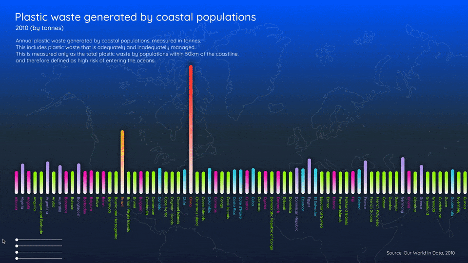
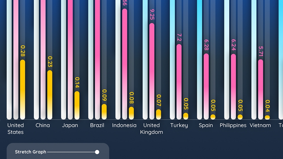
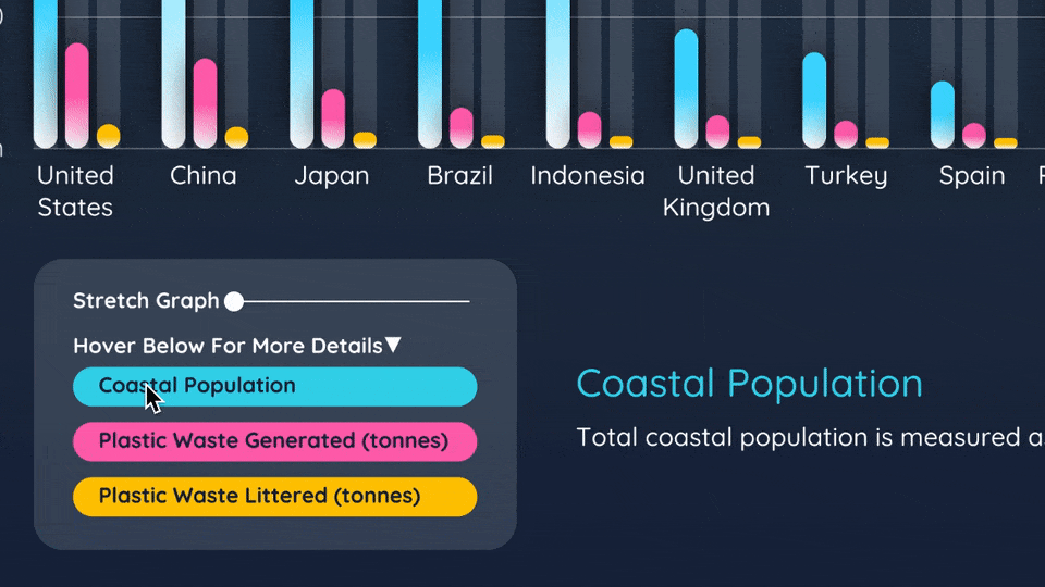
The topic that I have chosen to work on is Ocean Plastic Pollution. The pollutants consist of micro and macro plastics of all colours and sizes in the oceans. I have compiled a dataset of the Top 15 Countries Of Plastic Waste Generated, as well as two additional two variables - Plastic Waste Littered and their Annual Coastal Population, in order to give a bigger context to the countries’ pollution contributions per capita.
Kindly watch a video of my abstract sketch
here should you face any difficulties loading it.
Reflection
Ocean plastic pollution is a serious global environmental issue. More than 8 million tonnes of plastic enters the world's seas each year, which is 3% of global plastic waste. My visual design is inspired by the colourful visuals of seemingly pleasant-looking microplastics. My data tells the relationship between coastal populations and their contribution to plastic waste generated and littered, which have a high risk of entering the oceans. Through my project, I hope to provide viewers a sense of urgency of how inadequate plastic waste management within coastlines has a high risk of entering the oceans, resulting in a negative impact on our oceans and wildlife health.
Kindly watch a video of my graph sketch
here should you face any difficulties loading it.
Design decisions
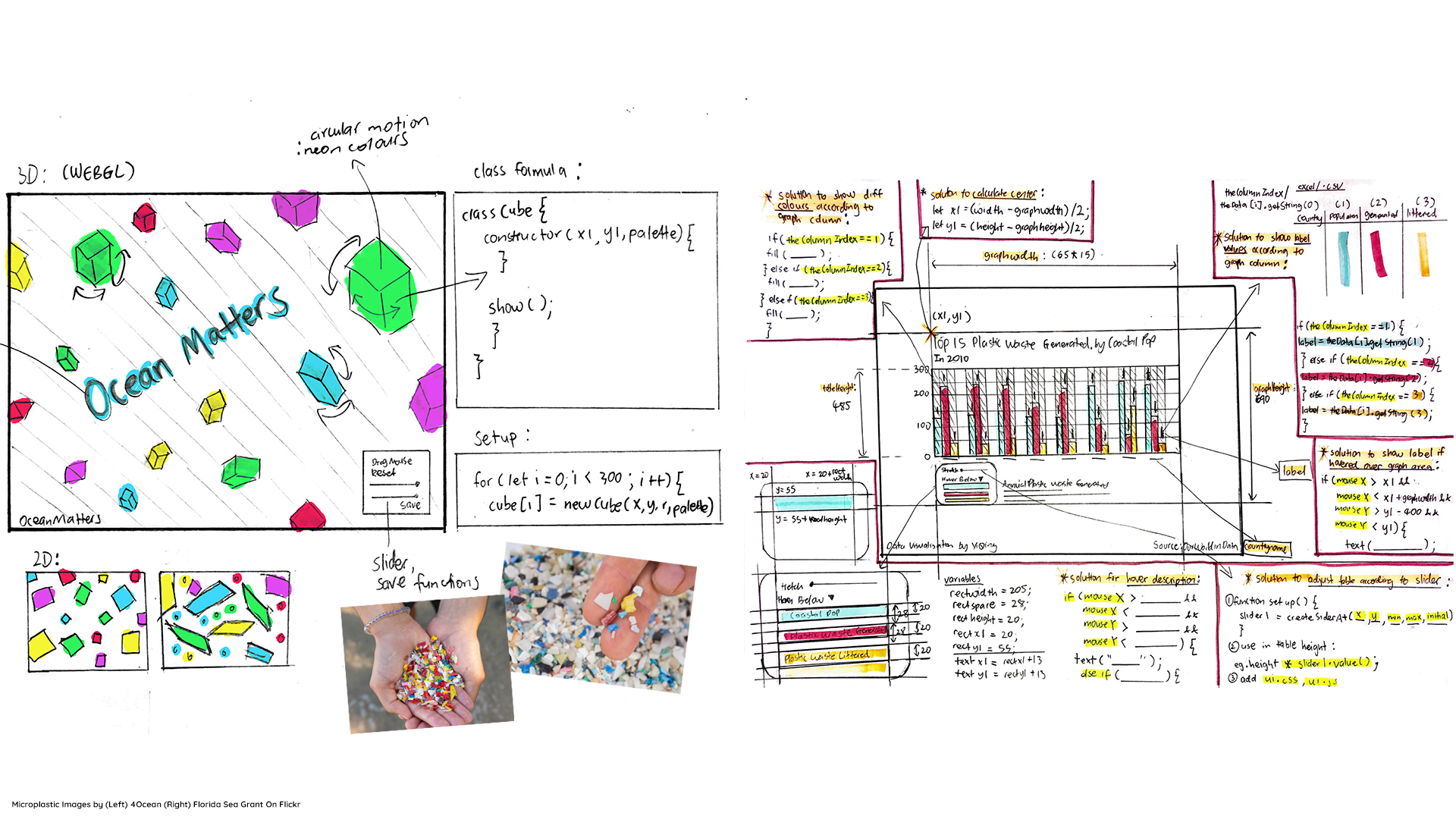
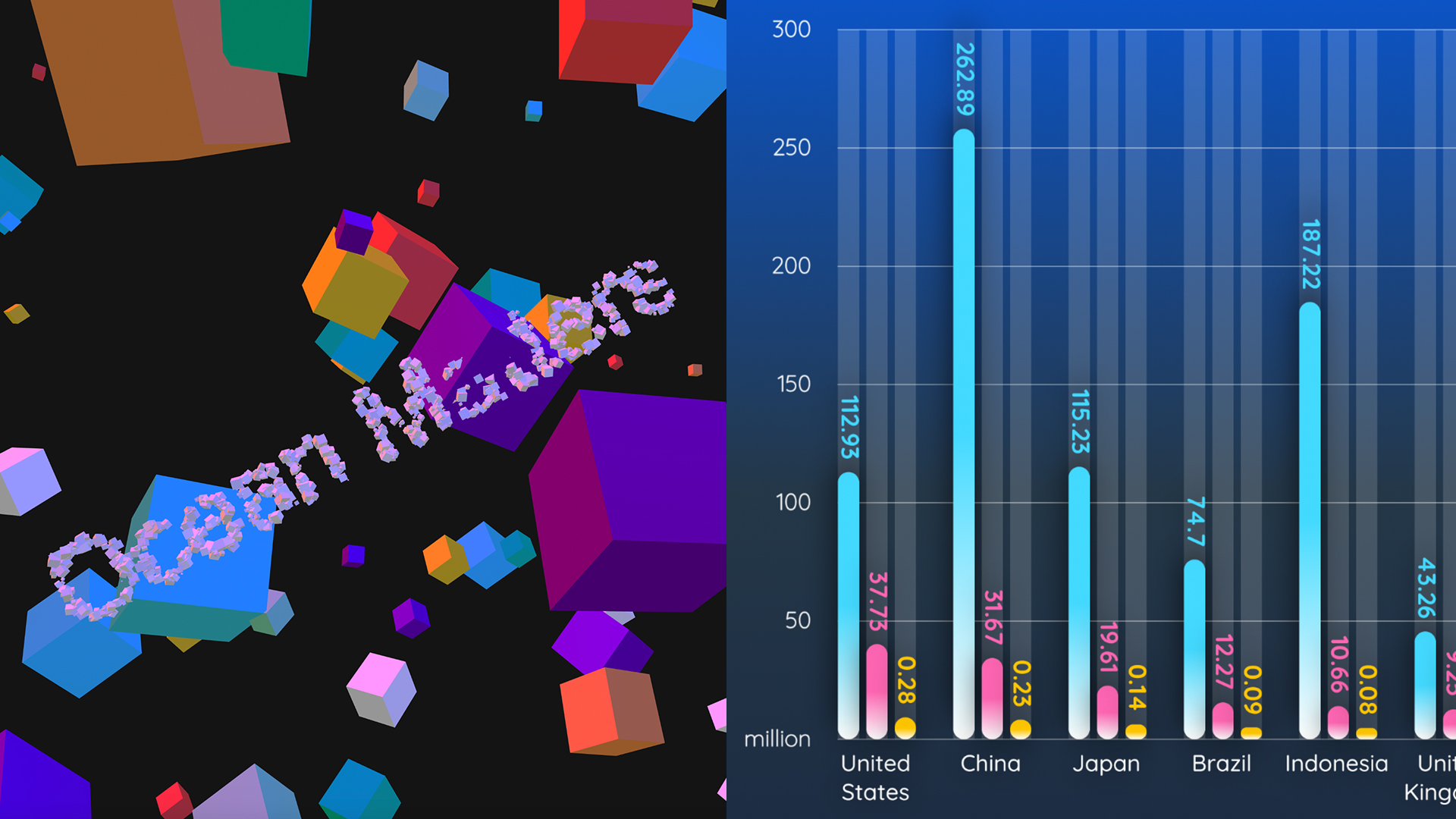
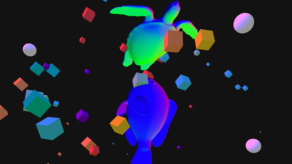
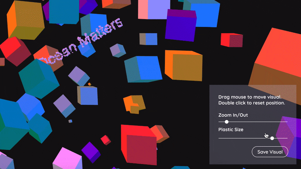
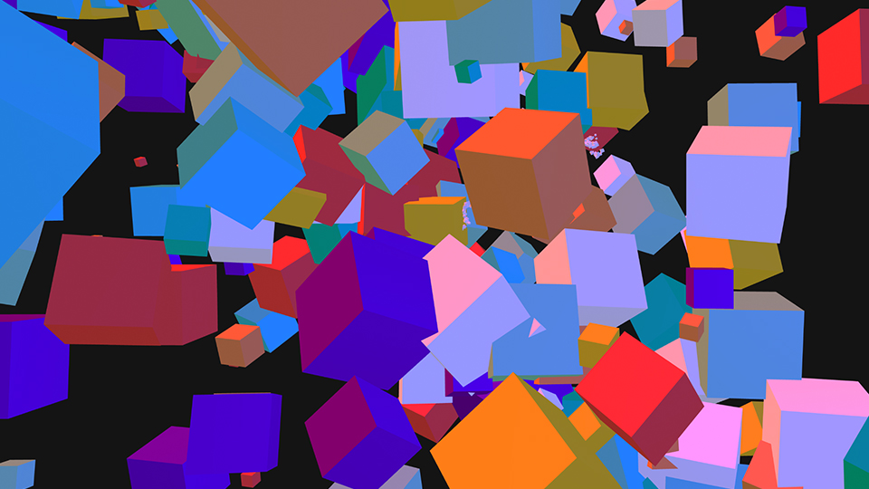
The dark visual with lighting effects provides a sense of the depth of plastic waste in the oceans. Inspired by the colours of plastics, I chose a neon gradient colour palette for a pop of colour. I coded interactive 3D abstract boxes moving in random dimensions to represent the relationship between ocean plastics and wildlife. Toggle the slider to switch between micro and macro plastics. An interactive 3-column bar graph features three relevant plastic data according to 15 countries. Clean typography and a sleek rounded typeface is used for maximum clarity.
Issues
The main issue I encountered with my interpretation sketch was multiplying and spreading the 3D boxes out in randomised, instead of fixed positions. On top of using for loops, I solved the issue by adding arrays of objects and class functions. The main issue with my data sketch was showing accurate labels for each column. I solved it by using the If and Else If concept.
Feedback
When I first shared with my peers my initial data sketch which has more than 100+ countries, they feedback that it is too cluttered and overloaded with information. After narrowing down to only 15 countries, they said that it looks better as it is easier to focus on and understand the data. The colours for my website and sketches fit the theme well.
Achievements
I managed to solve my coding issues independently through trial and error, sketching, and with the help from peers. By coding my interpretation sketch from scratch, I am proud of the original, abstract and interactive outcome. I have achieved my main objective of keeping my information design clear and concise through simplicity, with attention to small details.
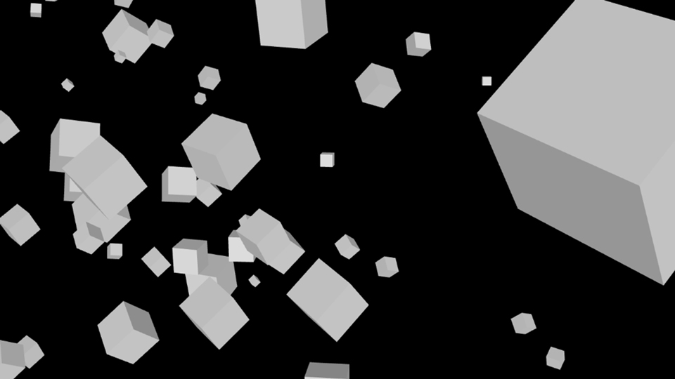
Initial graph exploration on sliders, gradients, data labels and challenging limits beyond windowWidth and Height.
Slider function to expand graph vertically.
Hover function to reveal more information.
Arrays of flying white cubes that I have initially coded myself using class function.
Explpring array of colours, spheres, and 3D animals using .OBJ render files.
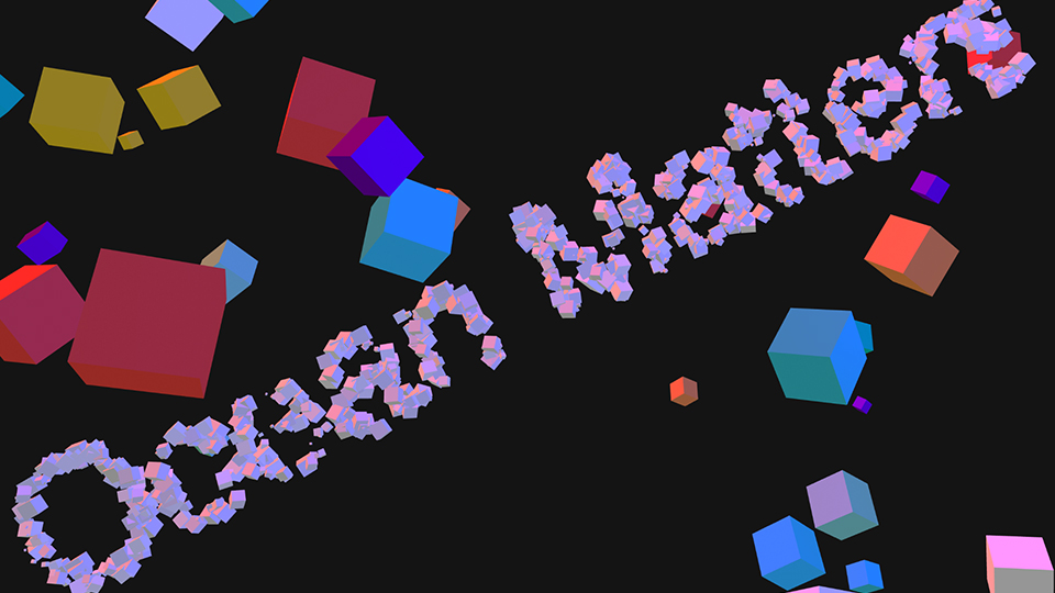
Rendering text using 3D box as a texture.
Interactive sliders to adjust depth and size of ocean plastic mess. Simple mouse functions to move plastic mess position.
Colourful boxes represents microplastics and macroplastics in the oceans.